
Redefining Courier Referral Program
The goal of this project was to increase the number of couriers joining Glovo through the referral program.
B2C
iOS app
Android app
Food delivery


The goal of this project was to increase the number of couriers joining Glovo through the referral program.
B2C
iOS app
Android app
Food delivery

4 weeks (design) + 16 weeks (engineering)
Prodcut Designer, Data Scientist, UX Researcher, UX writer, Product Manager, Software engineers (x3)
• +900bps referral contribution to CFO (courier’s first order)
• +200bps lead to CFO conversion
Glovo faced a fleet shortage in several markets, creating a big negative impact on the business. A key strategy for boosting courier numbers is through referral program. Yet, the existing referral system, operated via email outside the Glovo app, had numerous friction points and overall didn’t offer an optimal experience for couriers.
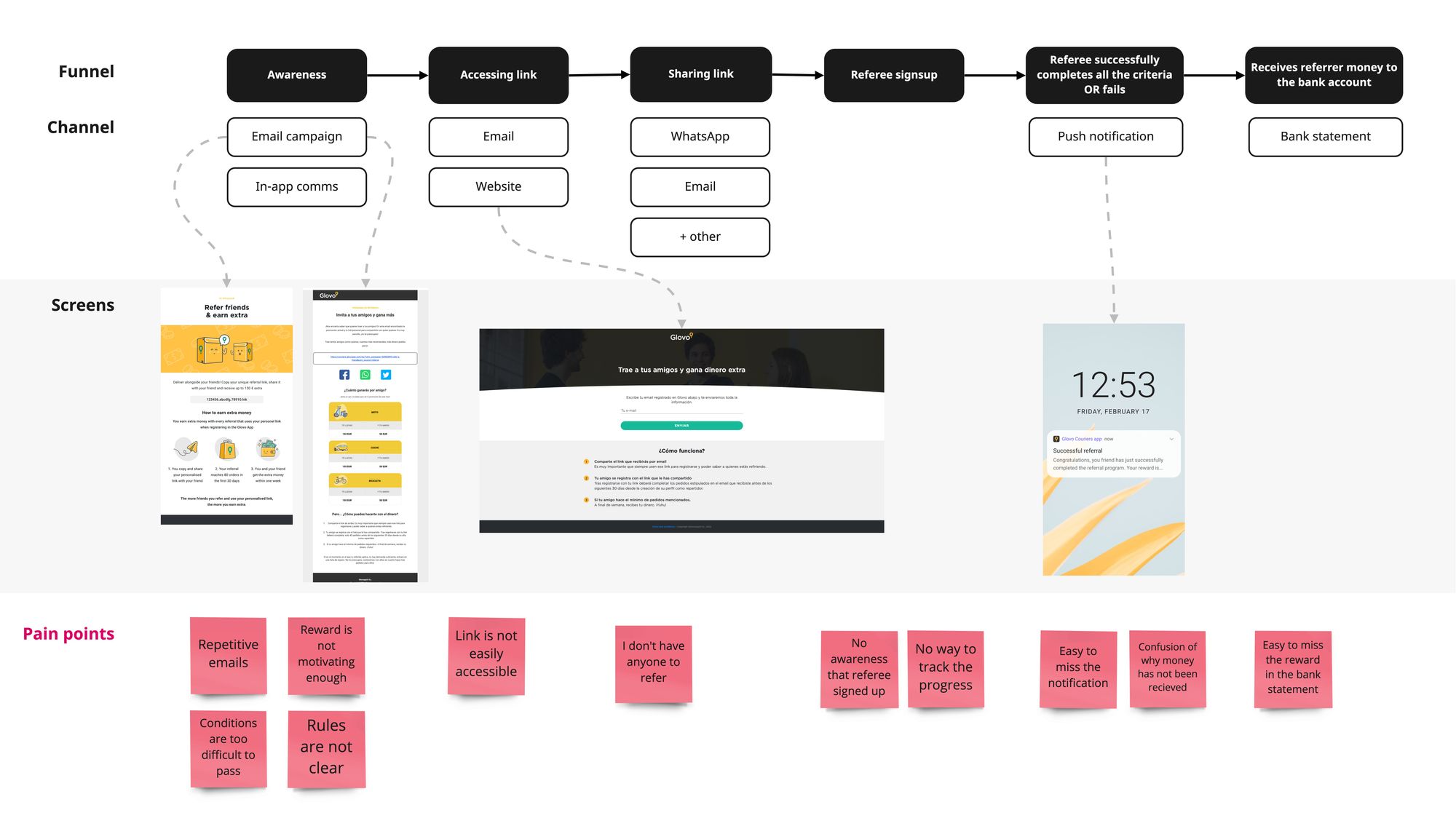
Old referral user journey had numerous pain-points
We had several hypotheses about the issues with the current referral experience but wanted to validate them with our users.
Assess current experience (awareness, perception and uses).
Understand main pain points and opportunities.
Visualise the ideal referral experience.
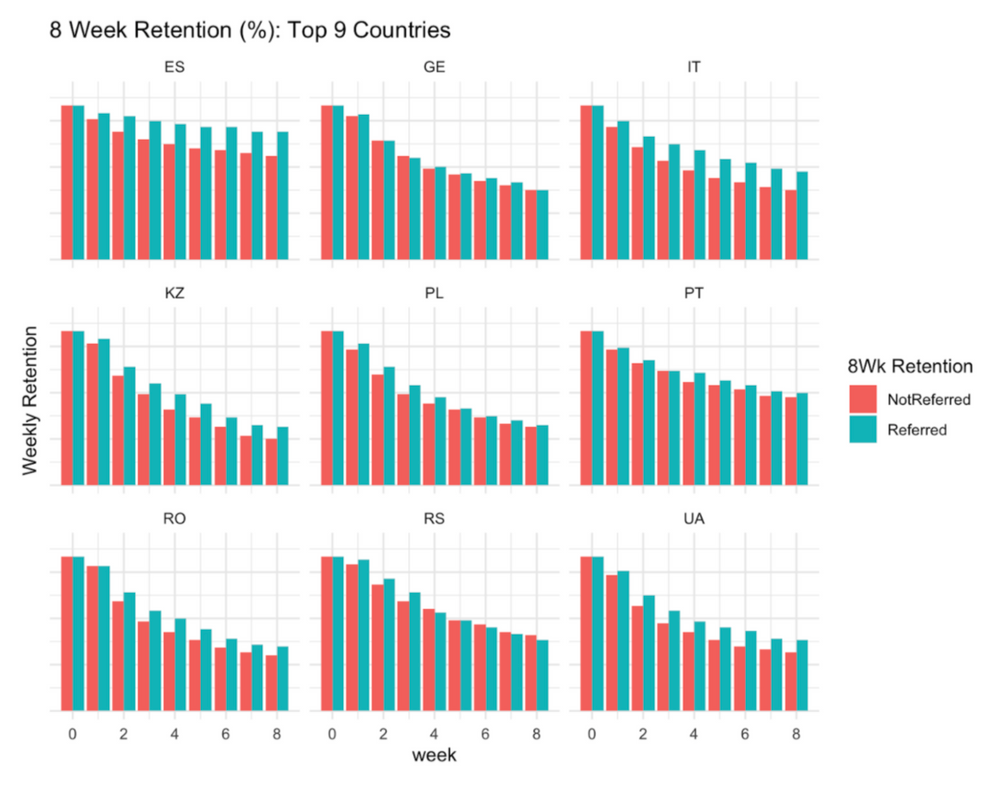
8 week retention rate of referred vs non-referred couriers
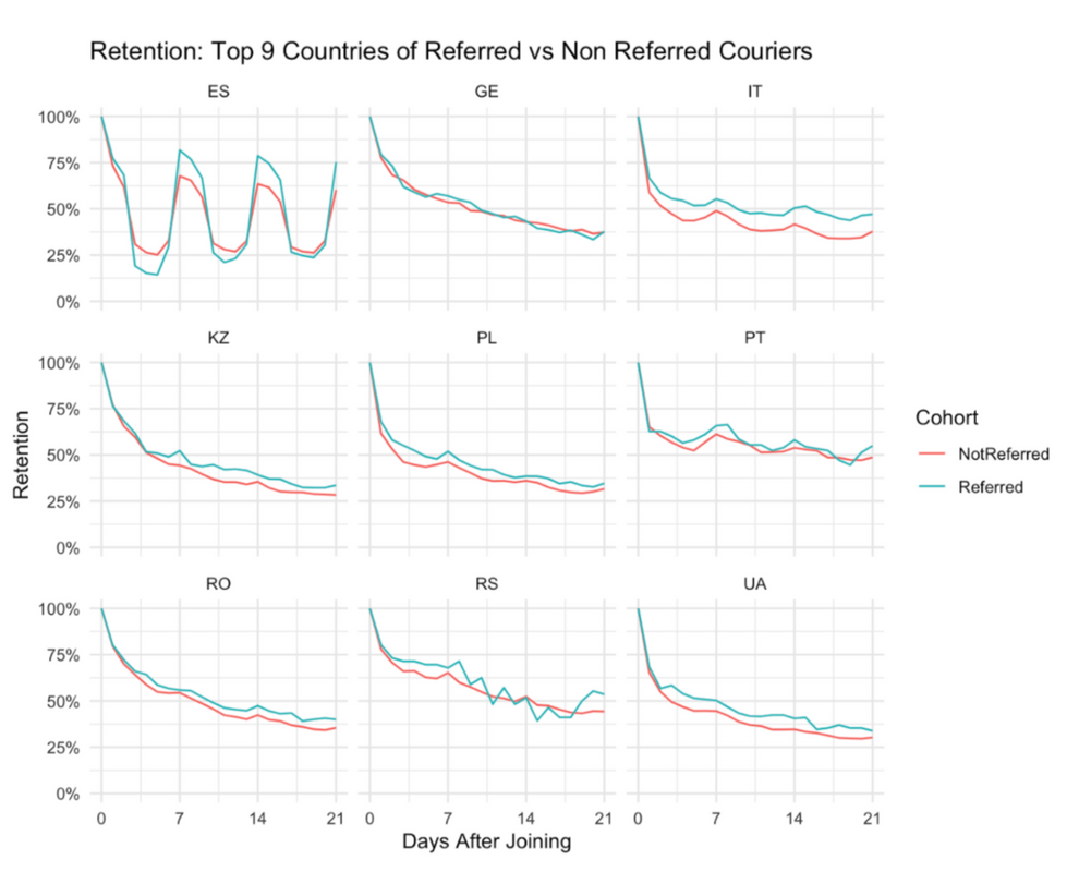
Retention rate of couriers of referred vs non-referred couriers
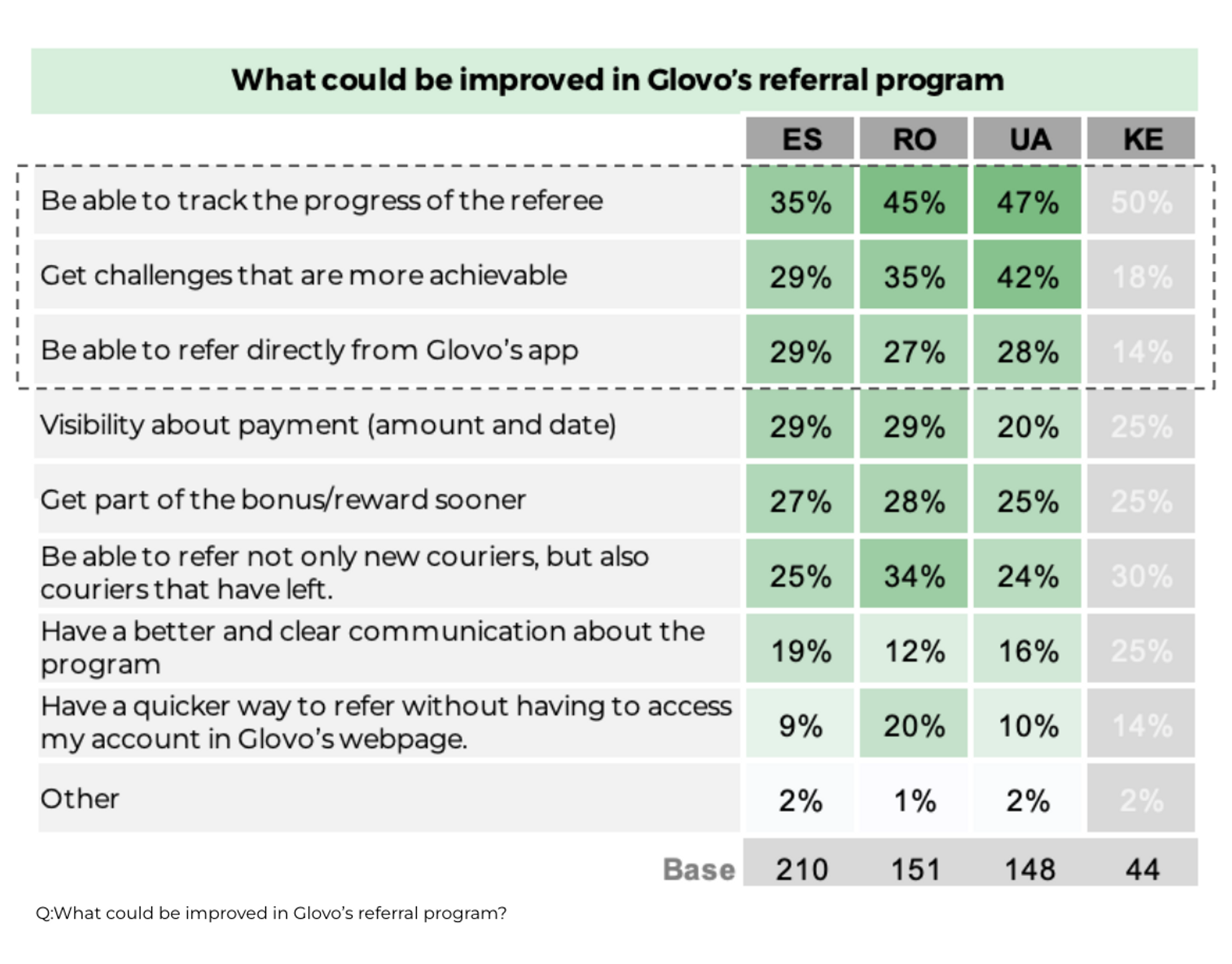
Survey results highlighting what could be improved in Glovo's referral system.
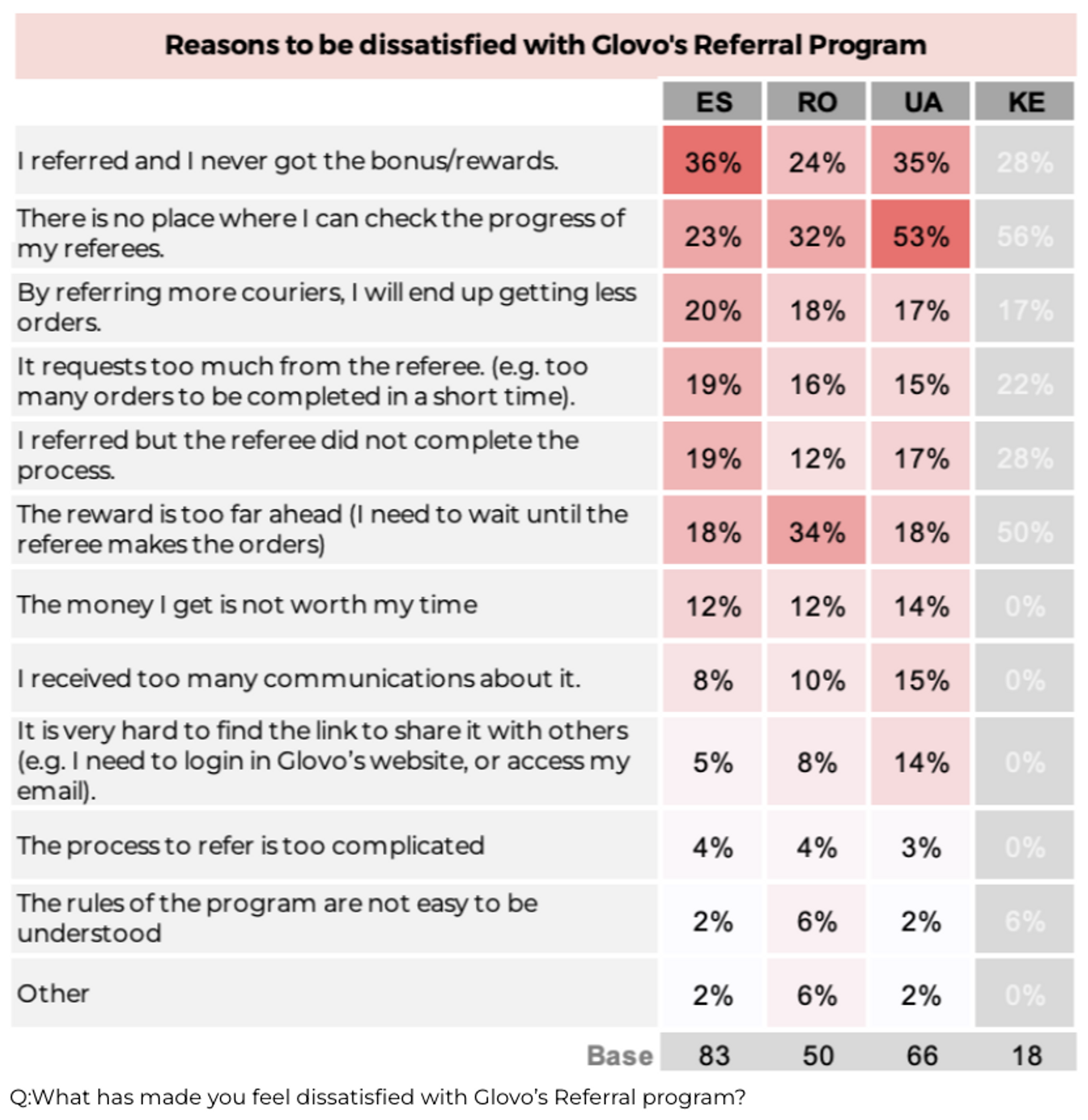
Survey results showing highest friction points with the current Glovo's referral system
This acted as an extra reason of why we should dedicate more resources to improve the referral program.
Because of the lengthy registration process, new joiner requirements, and lack of status updates, weeks or even months could pass before couriers received communication about the successful referral reward.
I’ve analysed referral programs of the direct competitors as well as products from a different industries in order to understand what kind of functionality they were offering. I saw that most of the referral features were very simple and only included basic description and ability to copy/share the referral link. Very few for example included a feature to track the live status of your referral.
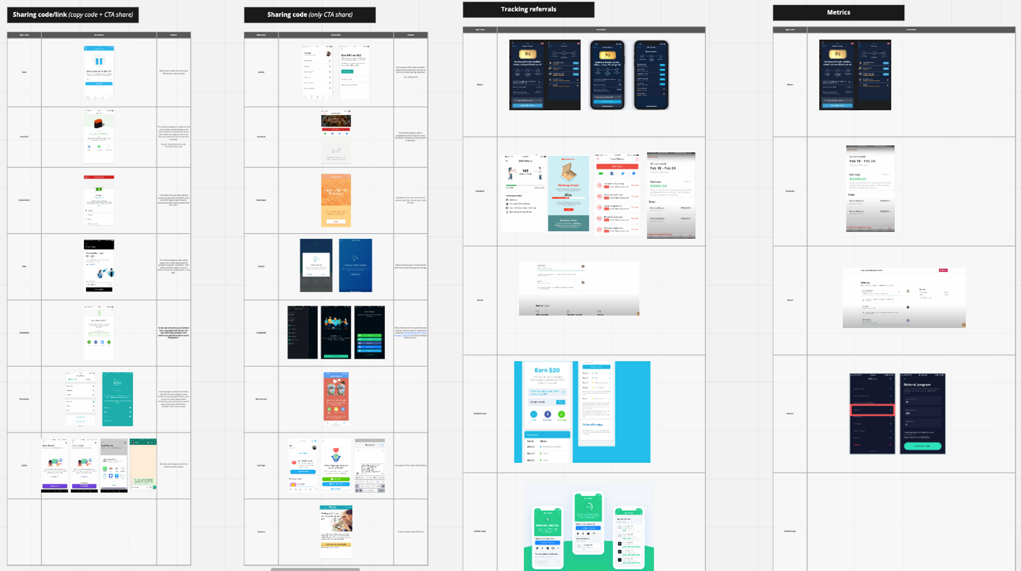
Analysing referral program solutions offered by the direct competitors as well as other products in the market.
It would be an unreasonable approach to build all of the listed features at once, as it would require an enormous amount of time and effort. In collaboration with stakeholders we have collectively prioritised features (gain creators/pain relievers) based on the perceived impact and engineering effort involved. Features that we believed would bring the most value to the user and at the same time involved less effort to implement were prioritised.
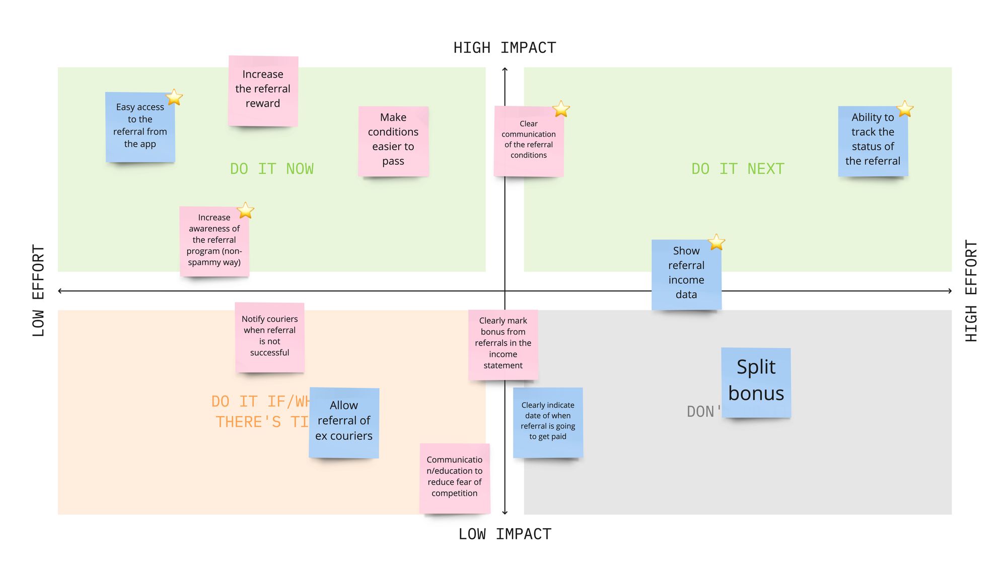
2x2 matrix used to help prioritise gain creators/ pain relievers. The ones that are marked with the star were prioritised.
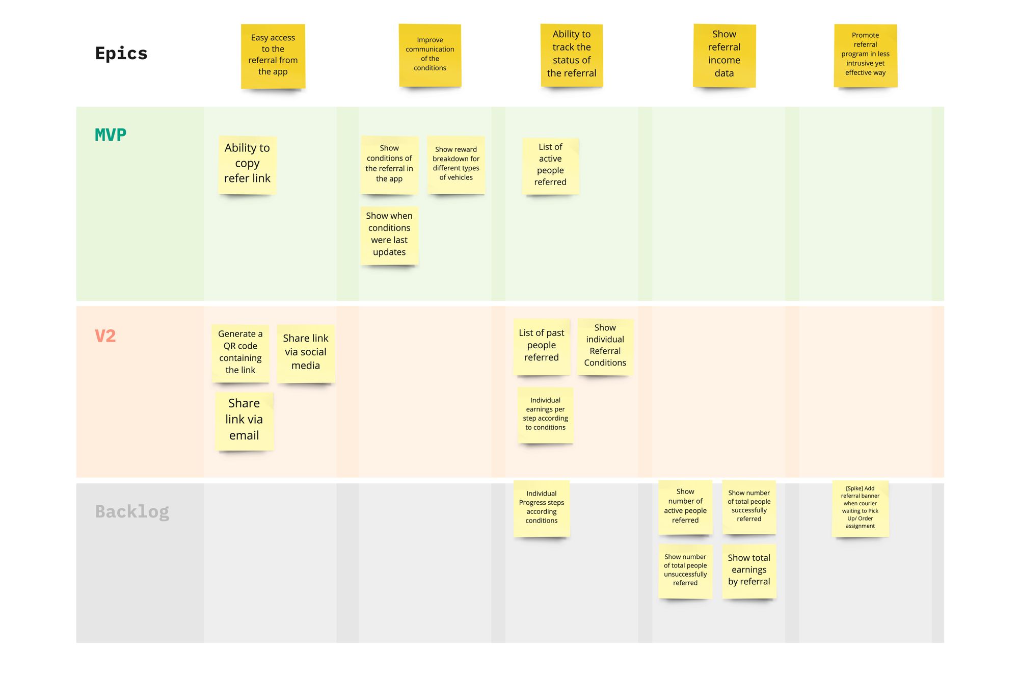
Breaking down epics into specific user stories and placing them on the version roadmap.
Having alignment on the solution's scope allowed me to proceed to the next stage. During the wireframe stage, I prefer to experiment with a multitude of different ideas. These experiments encompass trying out various flows, layouts, and information presented to the user. By broadening the exploration before narrowing down to a solution, I maximize the chances of finding the best solution.
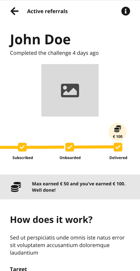
Detailed horizontal progress bar.
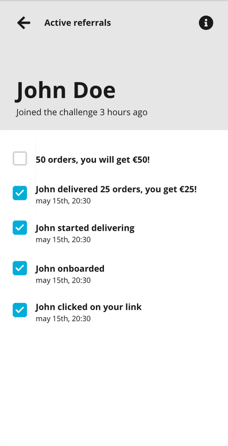
Detailed vertical check-list progress.
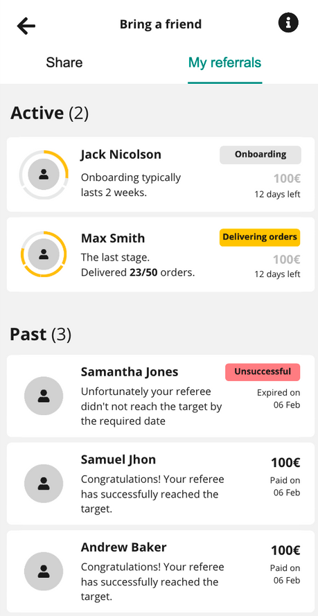
Progress overview cards.
Having explored variety of options, I have then presented several to the design team and stakeholders for feedback. After receiving feedback internally, I’ve decided to proceed with Option C, since it allowed to view progress of multiple referrals at the same time.
To further validate the solution, I conducted a quick round of guerrilla user testing by speaking to 5 couriers. During these sessions, I shared an interactive prototype, assigned small missions, and collected feedback. Overall, users' perception of the solution was positive. I incorporated the feedback provided during these sessions and ensured necessary amendments were made in the next round of fidelity.
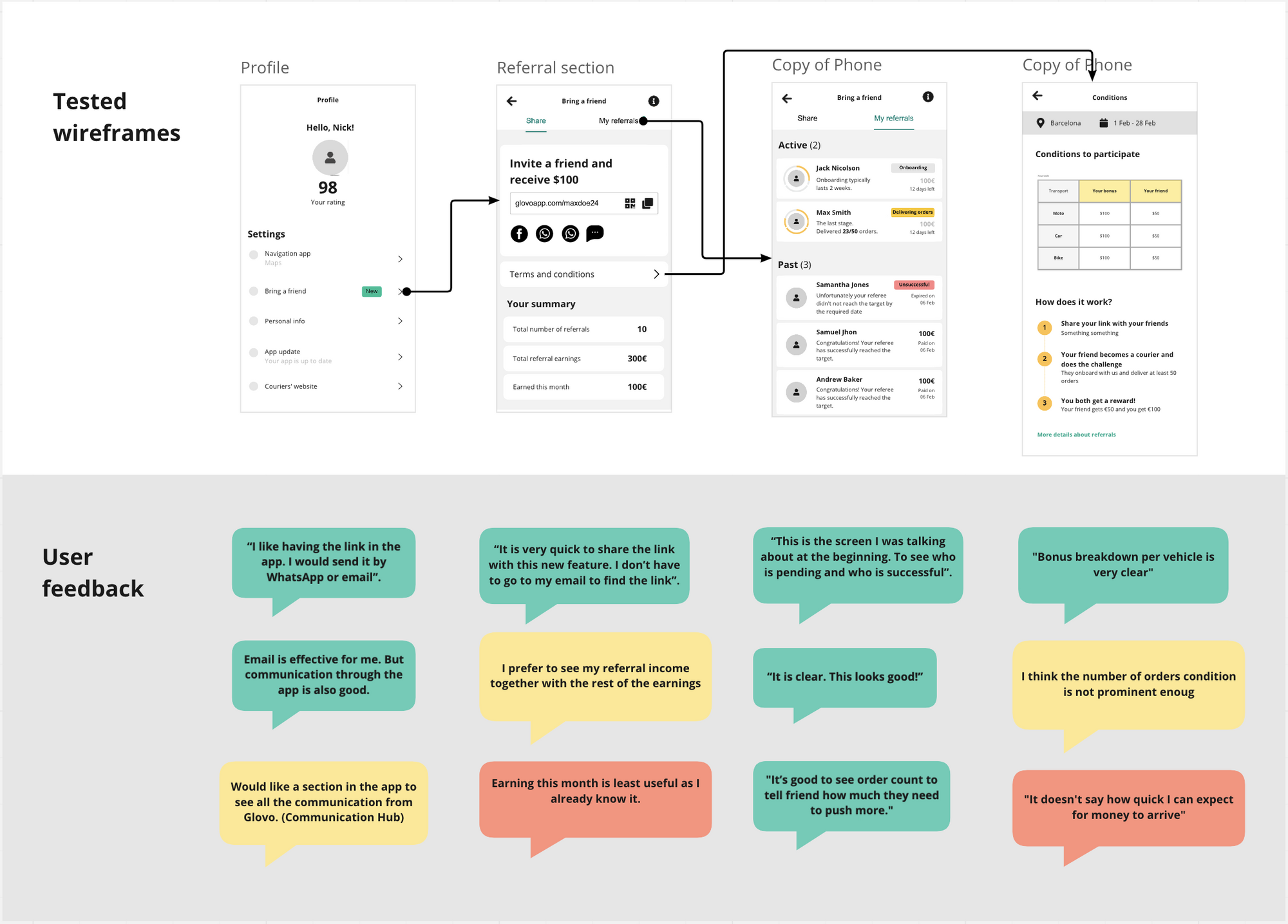
Mid-fidelity prototype and comments mentioned during the concept testing session.
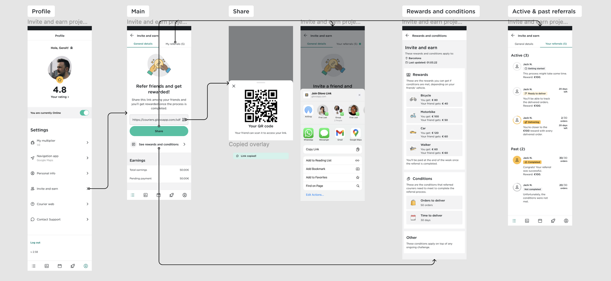
High-fidelity screnflow of the new referral feature
Before proceeding with design implementation, I wanted to conduct a final round of validation by performing usability tests with a larger sample of users. With the assistance of research ops, we recruited over a thousand testers across three markets: Kenya, Portugal, and Spain. All testers were active Glovo couriers. The overall results were positive, with the majority of users having no issues completing the tasks. However, there were several small changes I wanted to implement based on the test results, such as some copy iterations.
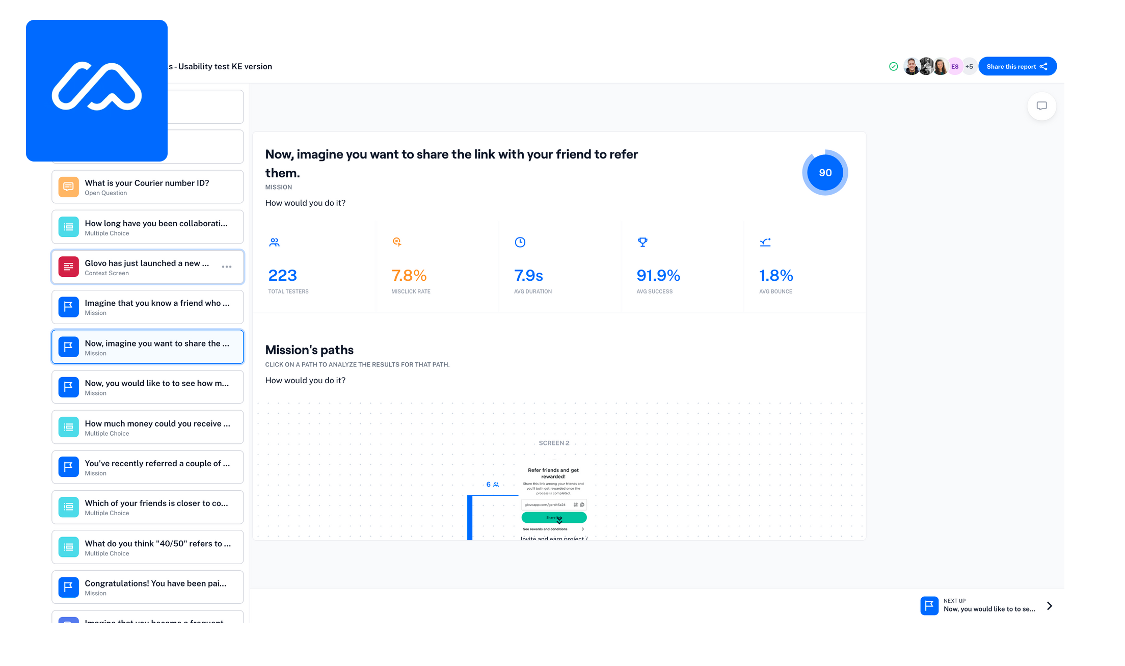
Screenshot of the Maze results report.
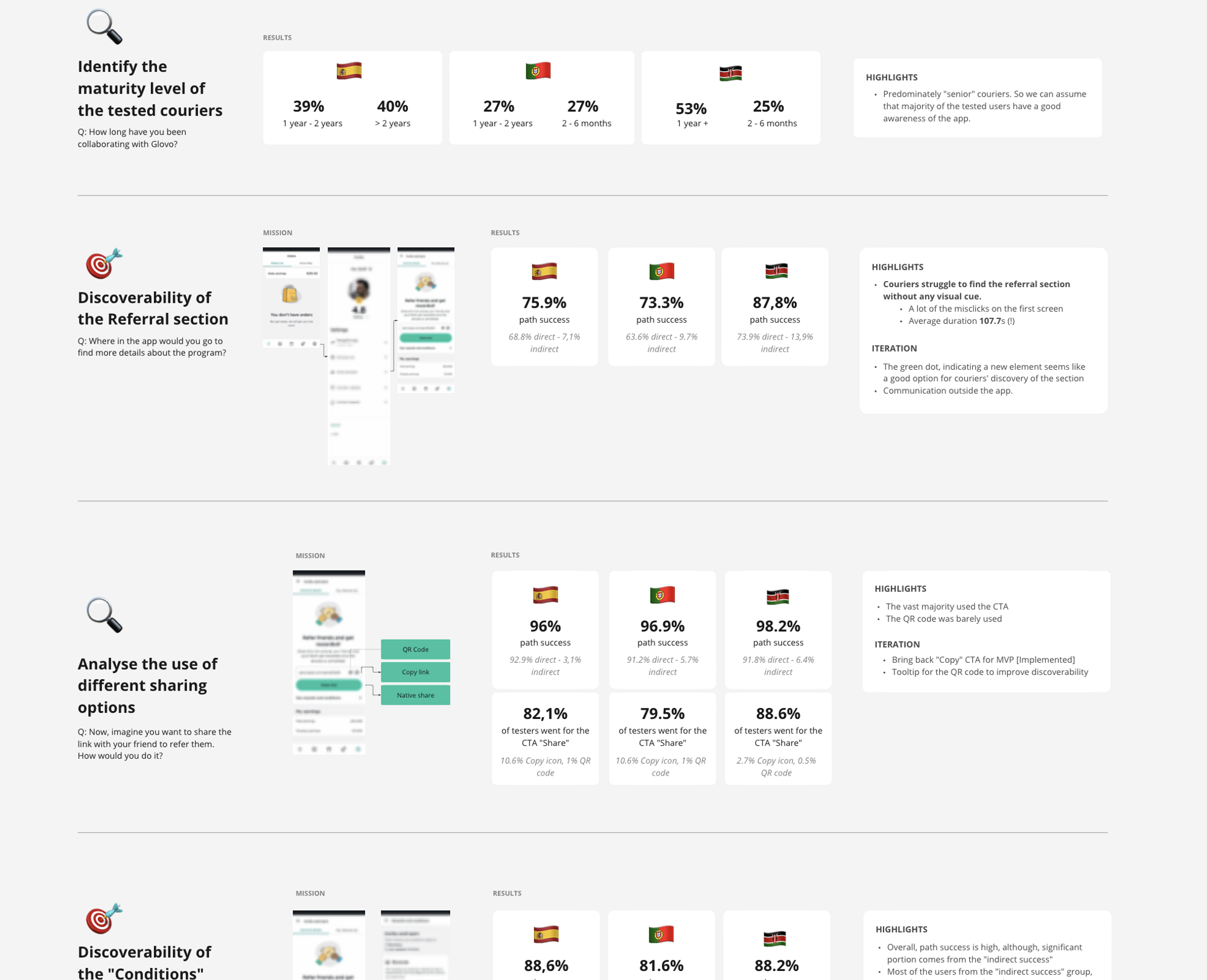
Screenshot of the Maze results report.
The hypothesis was proven to be successful and the feature had surpassed the expected impact.
Referral contribution to CFO
Lead to CFO conversion
Revolut
Identifying the problem and redesigning the onboarding flow to boost the percentage of users who successfully complete the onboarding process.
UI/UX
User Flows
Funnel Conversion